Table of Contents
Every affiliate site has an express purpose, a single goal it’s guiding visitors toward: the end of the sales funnel. Before visitors can reach this goal they’ll need to complete a specific action. The key is getting them to take that final plunge.
This is where your call to action (CTA) comes into play. A CTA is a message you present to your audience that lets them know exactly what you’d like them to do. This could be something like completing a purchase or signing up for a membership.
In this article, we’ll discuss CTAs further, including how to create one that can increase your conversions. We’ll also cover some tips for making your CTA compelling and effective. Let’s go!
An Introduction to the Call To Action (CTA)

In simplest terms, a CTA is a marketing device that’s used to prompt an immediate response from your audience. On affiliate sites, CTAs are often used to encourage conversions (i.e. sales).
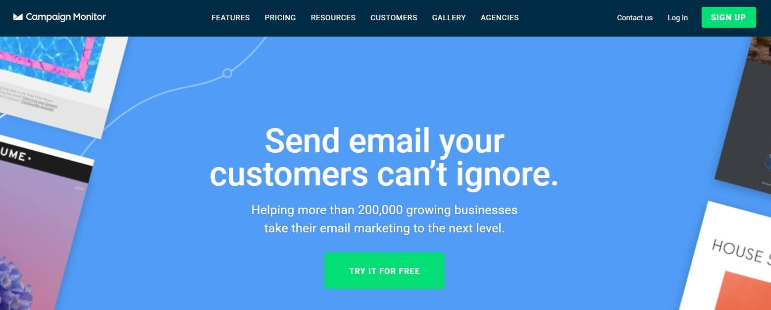
As such, they can appear in blog posts, such as on a banner in the middle of the page). They might also appear on product pages, for instance, as a strategically placed and designed button with a text prompt.
Every online business uses a CTA in some way or another. After all, it’s simply a message intended to encourage visitors to perform a specific action. As mentioned, this action could be buying a product, joining a newsletter, or signing up for an account or membership.
However, to be effective, your CTAs must be both clear and compelling. You don’t want your visitors to have to guess at what you’d like them to do. Instead, you need to provide explicit instructions for their next steps, and encouragement to move forward.
3 Ways to Create a Powerful CTA for Your Website
Now that we’ve covered the basics, let’s take a closer look at how you can make your CTAs more powerful.
1. Make the Message Engaging and Persuasive

If a powerful CTA is your goal, an engaging and persuasive message is a must. Creating such a message means using the right words. Of course, the phrasing you should use will vary depending on your audience and ultimate goal.
To get started, we recommend that you:
- Make the benefit of your products or services clear. For example, you can offer a free trial (so visitors can test a product out for themselves), or highlight some positive customer testimonials.
- Use powerful words and positive emotions. These choices will evoke good feelings in your visitors, which can compel them to click through to the next step.
Another option for making your message persuasive is to use specific terms rather than generic ones. Instead of “Try It Now”, for example, you can use CTA text such as “Click Here for Your 14-Day Free Trial”. This will give visitors a clearer sense of what they’ll get out of following your suggested action.
2. Choose the Right Colors

While the words you use are important, so is the presentation. How your CTA button looks can have a drastic effect on its success. This is why you must choose the right colors when designing a CTA.
However, the best color choice for one website may not be ideal for another. Since various colors have different connotations, you’ll need to spend time considering your goals, as well as the overall impression you want to give your visitors.
Most importantly, you’ll want to:
- Pick an emotion. For example, red is a solid option if you want to project a sense of urgency. However, if you’d rather promote a feeling of security for more reluctant buyers, blue is your best bet.
- Consider contrast. You’ll also want to think about how the CTA’s colors will look in the context of your website. You need your CTA to stand out, which means you’ll want to use colors that contrast with the rest of your design.
Do keep in mind that there are no hard and fast rules when it comes to color selection. However, following the general guidelines above will get you off to a good start.
3. Display Your CTA in a Prominent Location

Not only does the look of your CTA play a role in its success, where it’s placed has a significant effect, as well. This is because people usually read websites in an F-shaped pattern. In general, that means CTAs will perform best when placed at the very top of the page or somewhere near the middle.
However, there are other scanning patterns your visitors might follow, so it’s best to test and optimize your individual CTA’s placement. To do so, you can:
- Use a heatmap. This kind of tool will help you to see which placements work best on your website and will highlight where visitors tend to interact with your pages and posts most often.
- Use CTAs sparingly. If you have multiple CTAs in close proximity, you may confuse your audience. Be thoughtful about where you place CTAs, always considering user experience.
Don’t be afraid to test out different placements, as this will be the only way you can learn which locations are most successful on your website.
Conclusion
Having a powerful CTA is a key part of making your affiliate site profitable. If you can design a CTA that persuades people to complete the action you want, you’ll be in a strong position to increase your conversions and revenue.
In this article, we’ve discussed three ways you can create an effective CTA. These are:
- Make the message engaging and persuasive.
- Choose the right colors.
- Display your CTA in a prominent location.
Do you have any questions about how to power up your website’s CTAs? Let us know in the comments section below!
If you liked this post, be sure to follow us on Twitter, Facebook, and LinkedIn! And don’t forget to subscribe in the box below.


Leave a Reply